There was a time when real estate agents helped people buy and sell homes. Then the market changed, and now we do a lot more counseling, some financial advising, negotiating short sales with banks, and on the flip side – evaluating properties for banks as they liquidate their foreclosed assets. Regarding the latter, banks ask real estate agents to complete BPOs (broker price opinions), to give them an understanding of the local market and an evaluation of the property’s value. Banks do not pay agents well for this service, but agents (including myself) do them in the hopes of listing bank-owned properties.
When completing BPOs, I have enough experience that if I’m familiar with the neighborhood I have an intuitive idea what the price of the home should be before I go about the work of proving it. My intuition is not enough for the banks though, so I have to complete a fairly rigorous form that goes over statistical averages for the neighborhood of the home that I’m evaluating.
I hate BPOs – but the truth is, doing them on a regular basis makes me a better agent. It’s easy to take what’s true for a majority of neighborhoods and assign the same market symptoms to every neighborhood. For instance, when evaluating most markets in Snohomish County, it’s easy to say that home values dropped 8-12% in the last year, or almost 1% every month. Here’s a graph to prove it (click on graph to load full scale PDF report):

If it’s a little small to read, here’s what you need to know. For all residential properties in Snohomish County, the average price has dropped 7% and the median price has dropped 8%. I’m not a statistician, and better people than I can explain the variables involved in a comparison like this, but the sake of brevity, let’s accept these values and move on (smile inflected).
So now, if you’re a homeowner in Snohomish County, I’ve just taken the wind out of your sails. Most people are hoping that we’re at the bottom, but with drops like these, that doesn’t seem to be the case. I’ve been saying for a long time that I don’t think that we’re at the bottom of anything, and until we get rid of the short sale and bank-owned inventory, it could be awhile until will do. But I would be in error if I led people to believe that this is the case everywhere.
Case in point: I recently had to complete BPOs in the Silver Lake / Silver Firs / Gold Creek / Cathcart neighborhoods, and I have two upcoming listings in these neighborhoods, and what I found was surprising (click on graph to load PDF report):

Compared to a year ago, the average price of homes in this neighborhood went up 7%, and the median price of homes sold only came down 1%. I do quite a few BPOs, and as I mentioned, I’d grown accustomed to seeing depreciation in almost every neighborhood in Snohomish County. I’ve run these stats on different sizes and styles of homes, but the emerging trend that I see in these neighborhoods (Silver Lake, Silver Firs, Gold Creek & Cathcart) is that maybe – just maybe – we’re seeing signs of a stabilizing market.
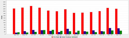
No one will know for sure for several months, and just because we see some markets stabilizing doesn’t mean that the trend will continue. No one really knows what the impact of the tax credit expiring (eligible buyers had to be under contract by April 30th) means for the real estate market, but I can tell you that just about every neighborhood saw unusually high sales activity in March and April, and based on the trend for May thus far, activity will probably fall far short of those numbers. Even then there’s a trend – if you’re a homeowner in the Silver Lake, Silver Firs, Gold Creek & Cathcart neighborhoods, or if you’re a home buyer considering how much a neighborhood effects values, consider these graphs (again, click on either graph for a full PDF report). Let’s look at all of Snohomish County first:

So the red bar is the inventory of homes available (which is down 2% from last year), the blue bar is the number of homes under contract (up 33%) and the green bar is the number of homes sold (up 36%). Good news right? Anytime supply drops and demand goes up it’s a good thing.
Now consider the Silver Lake, Silver Firs, Gold Creek & Cathcart neighborhoods:

In comparison, available inventory in these neighborhoods dropped 1%, homes under contract rose 292%, and homes sold went up 88%!! So while it seems obvious that the expiration of the tax credit inspired home buyers to get in the game, it seems as though these areas are generating more sales activity than surrounding areas.
Overall, this is good news. I’ve gotten so used to seeing negative trends in our market that it took me a little while to recognize a positive trend. Do I think that that this means that we’re through the worst of it? No. Can I pause and enjoy the respite that a positive trend brings? Yes.
We’ll be doing further statistical posts regarding neighborhoods in Snohomish and King Counties, but if you need an analysis of your neighborhood in the meantime, please let me know.
May 12, 2010
Jesse,
Thanks for the information. I really appreciate the data that you shared in the article about stabilizing markets. I think you do a great job of sharing honest information with your clients through the newsletter and your website. Keep up the good work!! I also wanted to tell you that I appreciate your honest opinion. On multiple occasions I have caught you being very honest with me, even if you knew its not what I wanted to hear. Thanks!! I frequently read your posts and always enjoy them. Stay in touch.
Jay